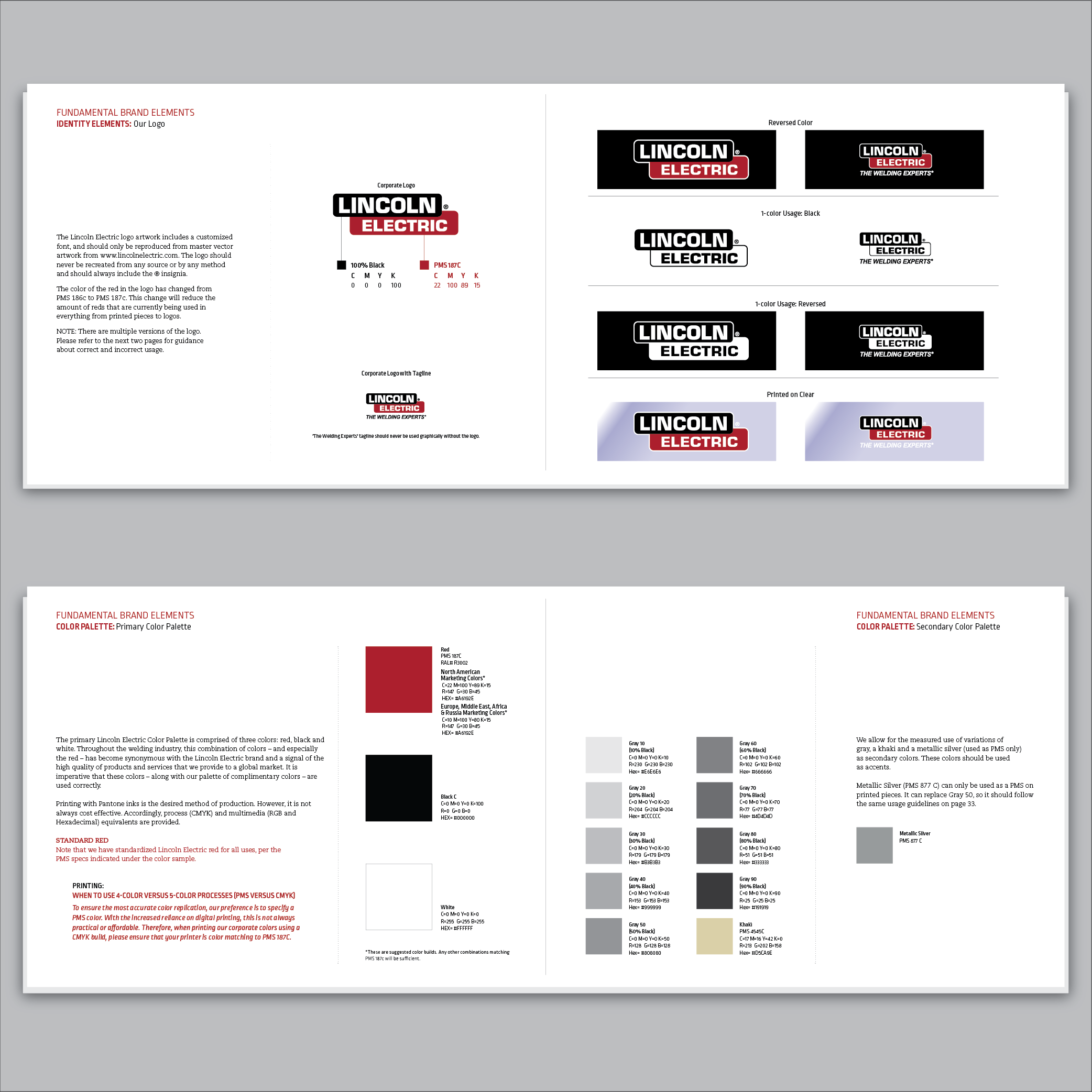
Branding is very important to a company, in 2014 it was decided to update our standards to make our presence globally easier to manage. A simplification and clarification of colors, especially the main red that we are known for in our industry. A font that could be utilized by more countries and simple art elements that when used properly and consistently helped strengthen our brand. It took a little over a year, with input from all the global marketing counterparts and was implemented in 2015. It continues to be a fluid document as we expand and adjust as needed.

Previous
Previous
Wayfinding Signage
Next
Next